Did you know that over 60% of all web traffic now comes from mobile devices?
If your website isn’t mobile-friendly, you could be:
❌ Losing rankings on Google
❌ Frustrating mobile visitors with poor user experience
❌ Missing out on leads, sales, and engagement
Google now prioritizes mobile-friendly websites when ranking search results—a practice called mobile-first indexing.
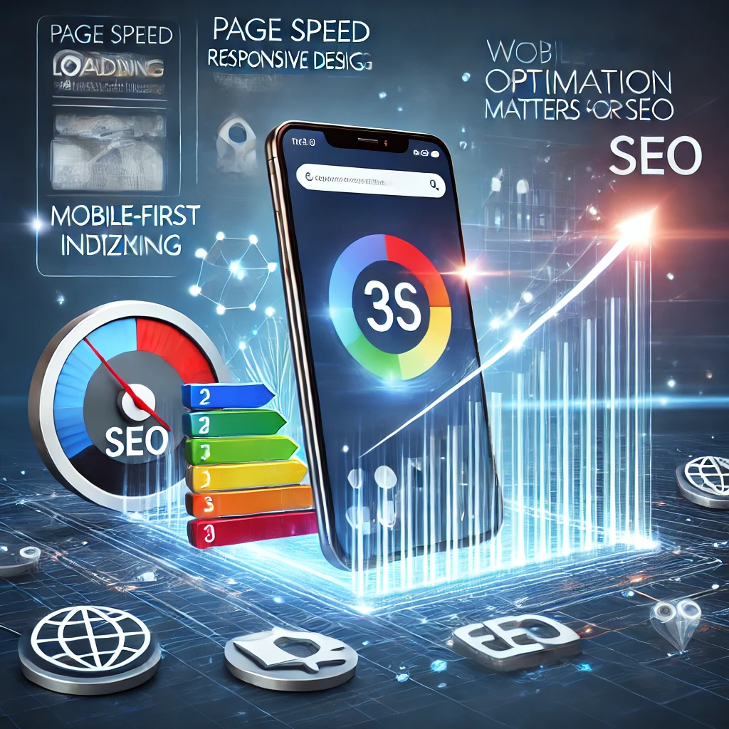
In this guide, we’ll cover why mobile optimization is crucial for SEO and how to ensure your website is mobile-friendly.
What is Mobile Optimization?
Mobile optimization ensures your website loads quickly, displays correctly, and functions smoothly on mobile devices (smartphones & tablets).
✔️ Fast load times (under 3 seconds)
✔️ Responsive design (fits all screen sizes)
✔️ Easy-to-read text & clickable buttons
✔️ No intrusive pop-ups or broken layouts
🚀 A mobile-optimized website = better user experience & higher Google rankings.
Why Mobile Optimization Matters for SEO
1️⃣ Google Uses Mobile-First Indexing
Google primarily crawls & ranks the mobile version of your website, not the desktop version.
📌 What this means:
✔️ If your site isn’t mobile-friendly, Google may lower your rankings.
✔️ A well-optimized mobile site improves your chances of ranking higher.
🚀 Your website must be optimized for mobile-first indexing to succeed in SEO!
2️⃣ Mobile Users Expect Fast & Seamless Experiences
📌 Facts About Mobile Users:
✔️ 53% of users abandon a website if it takes longer than 3 seconds to load.
✔️ 80% of mobile users leave if a website isn’t mobile-friendly.
💡 Google prioritizes websites that provide the best mobile experience.
🚀 If your website isn’t mobile-friendly, users will leave—and Google will notice!
3️⃣ Page Speed is a Google Ranking Factor
Google considers page speed as an important SEO ranking signal.
Slow websites = lower rankings and higher bounce rates.
💡 Test Your Mobile Speed:
✔️ Use Google PageSpeed Insights (https://pagespeed.web.dev/)
✔️ Aim for a mobile page speed score of 90+
🚀 A fast-loading mobile site = higher rankings and better conversions!
4️⃣ Mobile Optimization Increases Engagement & Conversions
✔️ 72% of users say mobile-friendly sites make them more likely to buy.
✔️ 57% of users won’t recommend a business with a poorly designed mobile site.
✔️ Google’s mobile-friendly algorithm rewards sites that enhance user experience.
💡 If your site is hard to use on mobile, visitors won’t stay, and Google will rank you lower.
🚀 A mobile-friendly site keeps visitors engaged and boosts conversions!
How to Optimize Your Website for Mobile SEO
1️⃣ Use a Responsive WordPress Theme
Your website should adapt automatically to any screen size.
✔️ Use a responsive WordPress theme like:
- Astra (Lightweight & fast)
- GeneratePress (Highly customizable)
- Kadence (Feature-rich & mobile-friendly)
💡 Test mobile responsiveness using Google’s Mobile-Friendly Test (https://search.google.com/test/mobile-friendly).
🚀 A responsive theme ensures a perfect user experience on all devices!
2️⃣ Improve Mobile Page Speed
📌 How to Speed Up Mobile Load Times:
✔️ Use fast web hosting – Choose Define Hosting for high-speed WordPress hosting.
✔️ Enable caching – Use WP Rocket or LiteSpeed Cache.
✔️ Compress images – Use Smush or ShortPixel.
✔️ Minify CSS & JavaScript – Use Autoptimize or WP Rocket.
✔️ Use a Content Delivery Network (CDN) – Cloudflare or BunnyCDN.
🚀 A fast mobile website improves user experience & SEO rankings!
3️⃣ Optimize Fonts, Buttons & Navigation for Mobile Users
📌 Make your mobile site easy to use:
✔️ Use large, readable fonts (14px+ for body text).
✔️ Make buttons & links easy to tap (at least 48px spacing).
✔️ Keep navigation simple – Use a hamburger menu.
✔️ Avoid pop-ups that block content.
🚀 User-friendly mobile design = better engagement & conversions!
4️⃣ Optimize for Local SEO (If You Have a Business Location)
📌 Local searches drive real customers!
✔️ 46% of Google searches are for local businesses.
✔️ 76% of people who search for a business nearby visit within 24 hours.
💡 How to Optimize for Mobile & Local SEO:
✔️ Claim & optimize your Google My Business listing.
✔️ Use location-based keywords (e.g., “Best plumber in Brisbane”).
✔️ Ensure your phone number & address are clickable on mobile.
🚀 A mobile-friendly local SEO strategy = more traffic & customers!
5️⃣ Use Accelerated Mobile Pages (AMP) for Faster Loading
📌 What is AMP?
✔️ AMP (Accelerated Mobile Pages) loads pages instantly for mobile users.
✔️ AMP pages are prioritized by Google for mobile searches.
💡 Best AMP Plugins for WordPress:
- AMP for WP (Easy setup)
- Official AMP Plugin by Automattic
🚀 AMP can significantly improve mobile load times & SEO rankings!
Final Thoughts: Mobile Optimization is a Must for SEO Success
If your website isn’t mobile-optimized, you’re missing out on traffic, leads, and sales.
✅ Key Takeaways:
✔️ Google prioritizes mobile-friendly websites (Mobile-First Indexing).
✔️ Fast load times improve rankings & reduce bounce rates.
✔️ Mobile-friendly sites have higher engagement & conversions.
✔️ Use responsive themes, optimize images, and enable caching.
✔️ Focus on local SEO & AMP for an extra boost.
At Define Hosting, we provide fast, mobile-optimized WordPress hosting to help businesses rank higher on Google.
🔥 Need help with mobile optimization? Visit Define Hosting today! 🚀
Need Help Optimizing Your Website for Mobile SEO?
Still unsure if your website is mobile-friendly? Our experts at Define Hosting can help you speed up, optimize, and improve your mobile SEO strategy.
📩 Contact us today for expert mobile SEO solutions!